Project carried out as a consultant for Radio-Canada as part of a course in the master's in interaction design at the Université Laval.
Context
This project was carried out in collaboration with Radio-Canada. The goal was to act as an external consultant by choosing, together with their team, a mandate and a problem to focus on.
Mandate
Understand young adults' relationship with the news through their use of third-party platforms, particularly social media, compared with Radio-Canada's digital apps, and identify levers to encourage redirection toward the Radio-Canada Info app.
Objectives
Explore the transition
Identify what draws young adults to other platforms in order to better guide them toward Radio-Canada's.
Encourage the digital switch
Find ways to make Radio-Canada's content more accessible and better suited to young adults.
Optimize the experience
Optimize the user experience and the gateways in the news-access journey toward Radio-Canada's digital platforms.
Problem
In a context of information overload and shifting media habits, many young people are turning away from traditional news platforms, such as Radio-Canada's apps, in favour of formats perceived as more accessible and faster.
Ecosystem
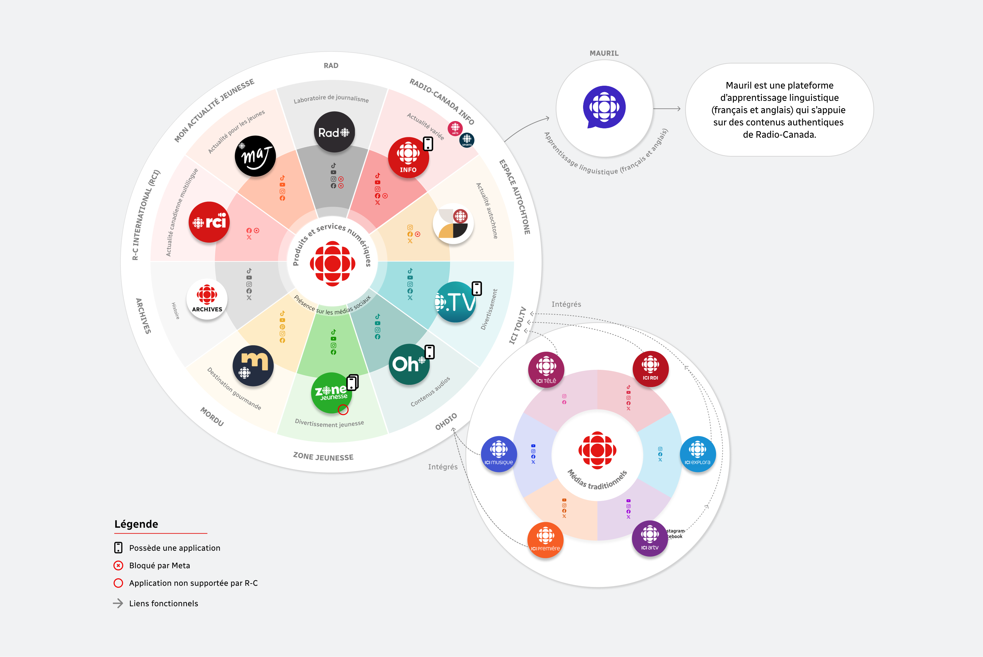
Products and services
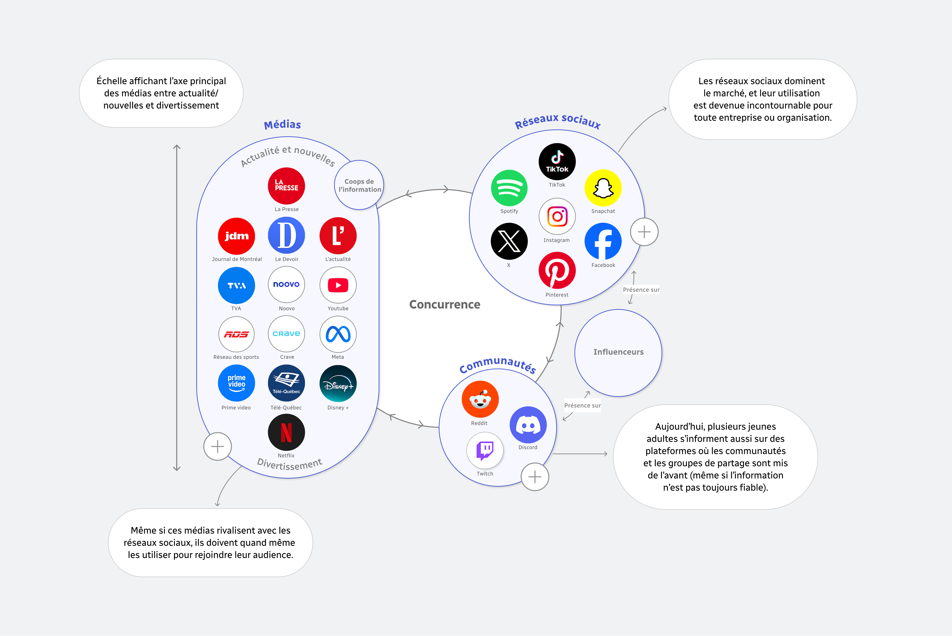
Competition
Research method
Semi-structured interviews
An open interview method used to gather rich, nuanced, and contextual data.
Usability testing
A qualitative observation method of the current R-C Info app, conducted after the semi-structured interview.
Content analysis
A qualitative self-observation method based on content analysis of the RC-Info app and social media.
Survey
A quantitative method using an online questionnaire with a representative sample of young adults.
Competitive analysis
Combined analysis methods (comparative, content, and observation) of competing platforms.
Findings and statistics
*Every finding and statistic comes directly from the research methods described earlier.
Moments of use
Moments of mobility and waiting represent opportunities for accessing information, since many young adults use these moments to stay informed or entertain themselves.
74%
of respondents say they usually do something else at the same time as checking the news.
46%
of respondents say they are on the move when checking the news while multitasking.
Habits
Young adults' digital consumption habits are deeply rooted in their daily use of social media and hard to change, but a majority of the young adults surveyed say they are open to adding a dedicated news app.
60%
of respondents say they save content to view later on Instagram or TikTok, showing an interest in save features.
Perceived effort of signing up
Creating an account is seen as a significant barrier for the majority of young adults, which can hinder acquiring new users.
75%
of respondents feel that creating an account is a major barrier to switching from social media to an app.
Formats
Short formats, especially video and audio, are the most appreciated, particularly while multitasking or on the move, and concise, explanatory carousels also generate strong interest.
40%
of respondents prefer written and visual summaries to consume news content.
40%
of respondents enjoy the podcast format for consuming content online.
65%
of respondents say they prefer short articles when it comes to reading.
Visual cues
Certain visual indicators and features reinforce fast information consumption and support young adults' habits, who appreciate feeling in control of the content offered to them.
86%
of respondents consider the subject or theme of the content to be important filtering criteria.
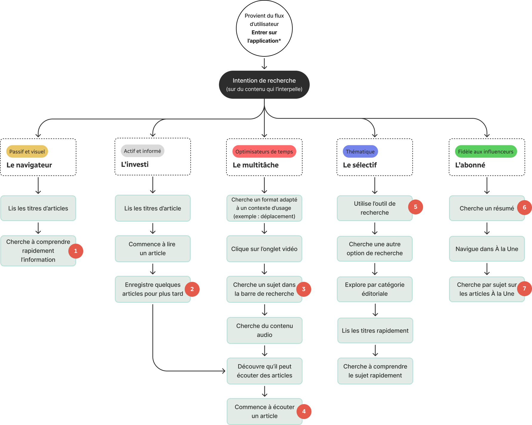
Personas
The Browser
Passive, gets informed by scrolling, and active on social media
Young adult who discovers the news by scrolling on TikTok, Instagram, or Facebook without looking for it. Consumes very short, visual formats, mostly between moments of entertainment, for example in queues, on transit, or before falling asleep.
The Engaged
Committed and highly interested in the news
Young adult who checks one or several credible sources per day or at different times of the day, along with a few social platforms. Prefers short, mobile formats, with the option to dig deeper as needed.
The Multitasker
Productive, wants to make the most of their time and optimize their commutes
Young adult who stays informed on the move through podcasts, summaries, or YouTube clips. Prefers short, audio content they can consume alongside other daily tasks, such as getting ready, cooking, or cleaning.
The Selective
Engaged in topics of personal interest
Young adult who consumes content based on thematic affinities (e.g. pop culture, music, sports). Has little interest in traditional news and hears about it through their circle or when it goes viral. Prefers simple, fast content.
The Follower
Loyal to news influencers and social media
Young adult who stays informed mostly through news influencers followed on Instagram, TikTok, or YouTube. Seeks out the news and prefers explanatory videos and summaries from various platforms over traditional media to follow local and international news.
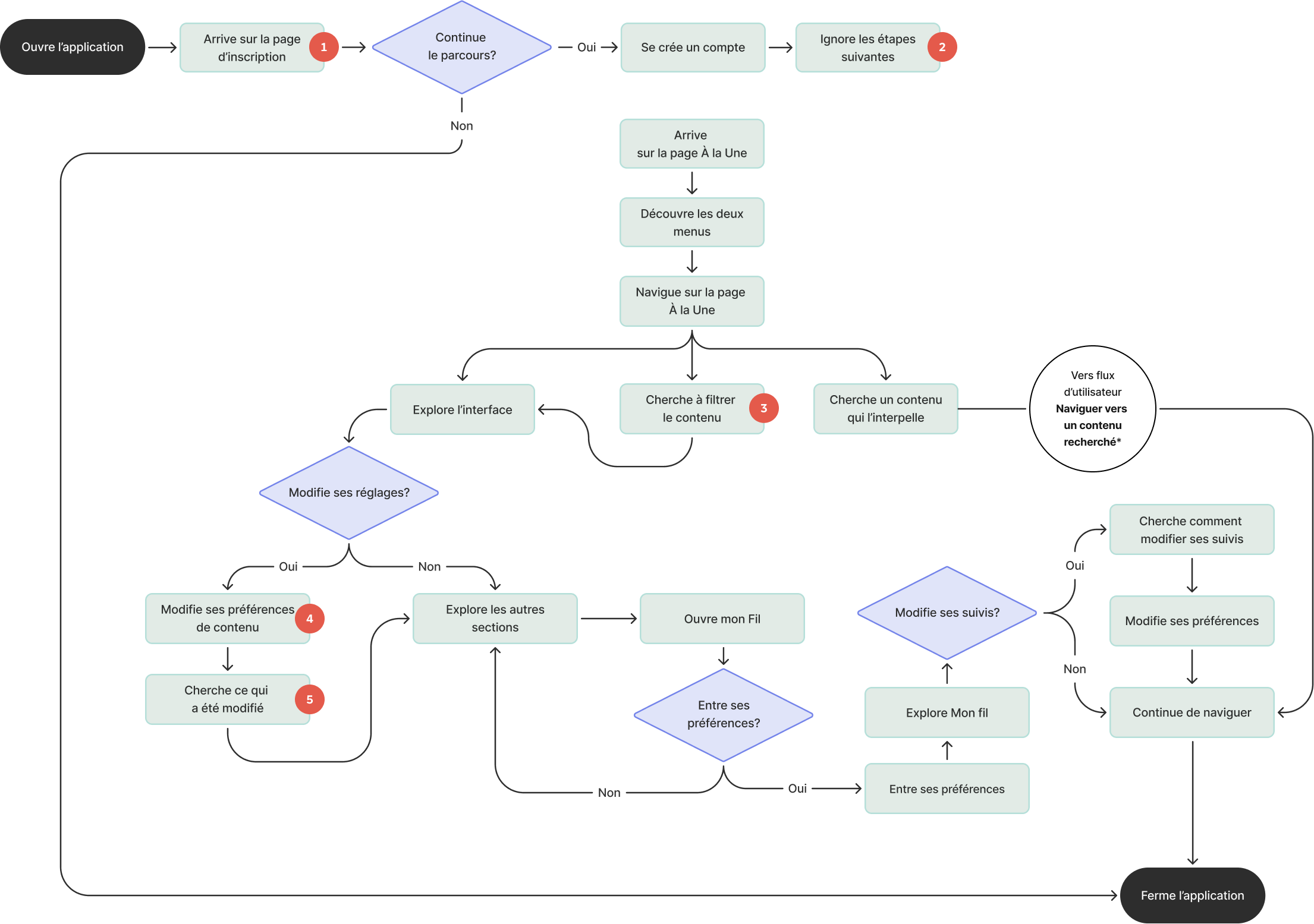
User journeys
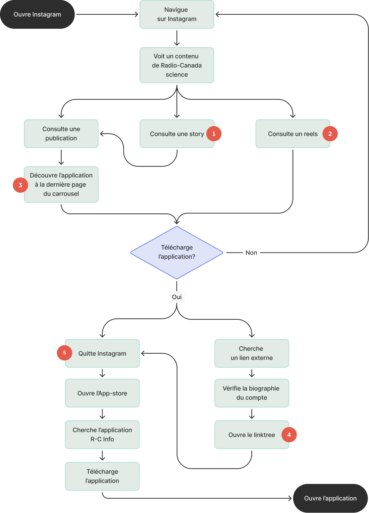
Journey 1
Installing the app
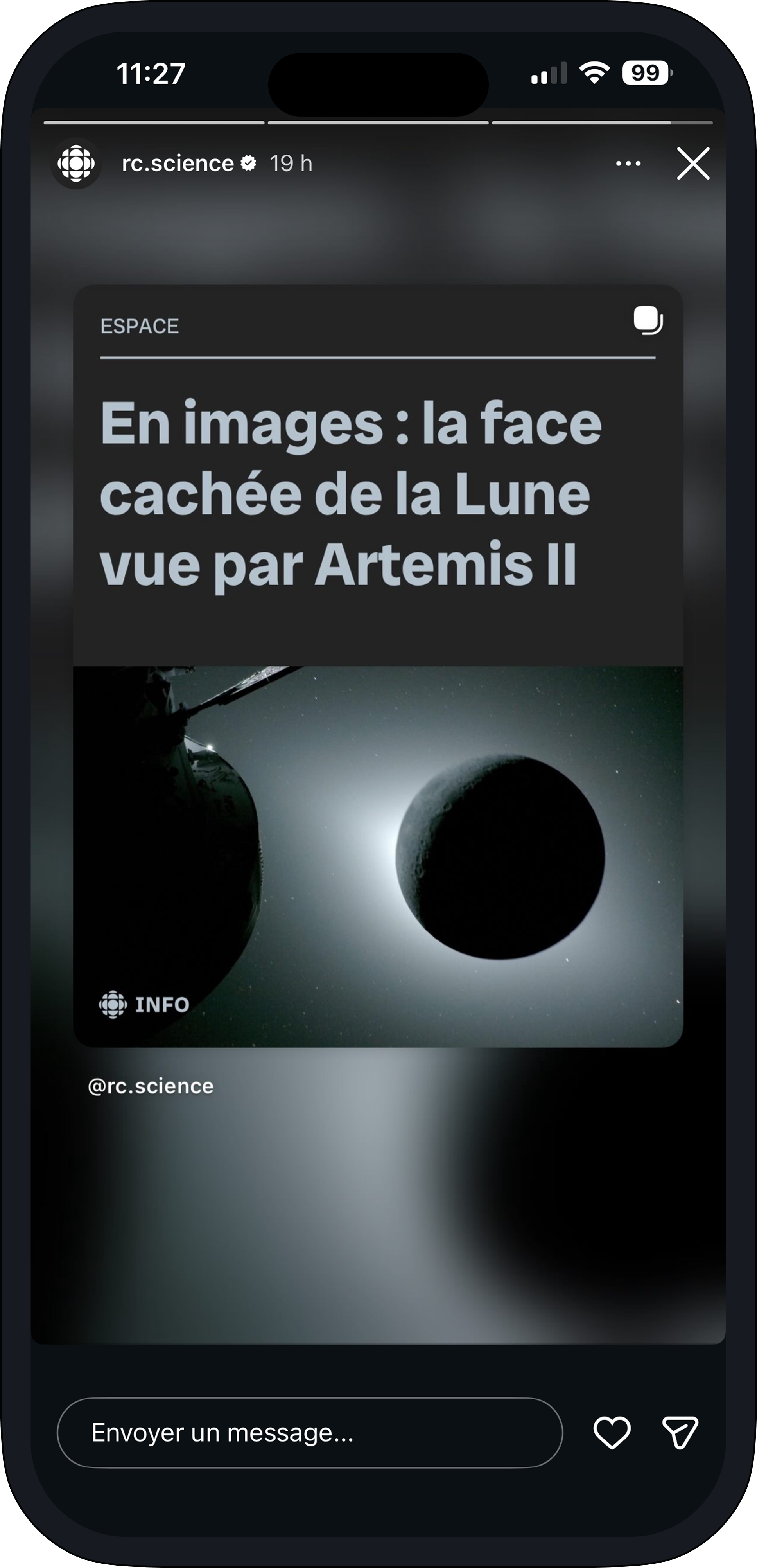
Journey of a user exposed to Radio-Canada content on Instagram, from initial discovery to accessing the Radio-Canada Info app.
Findings and frictions identified
Stories only redirect to the post, with no other switching option.
No switching option is put forward.
The only available redirection is at the end of the carousel.
No external link to the App Store is present.
The user has to search for the app themselves, with no shortcut available.
Journey 2
Entering the app
The user's journey, from opening the Radio-Canada Info app to discovery and general navigation.
Frictions identified
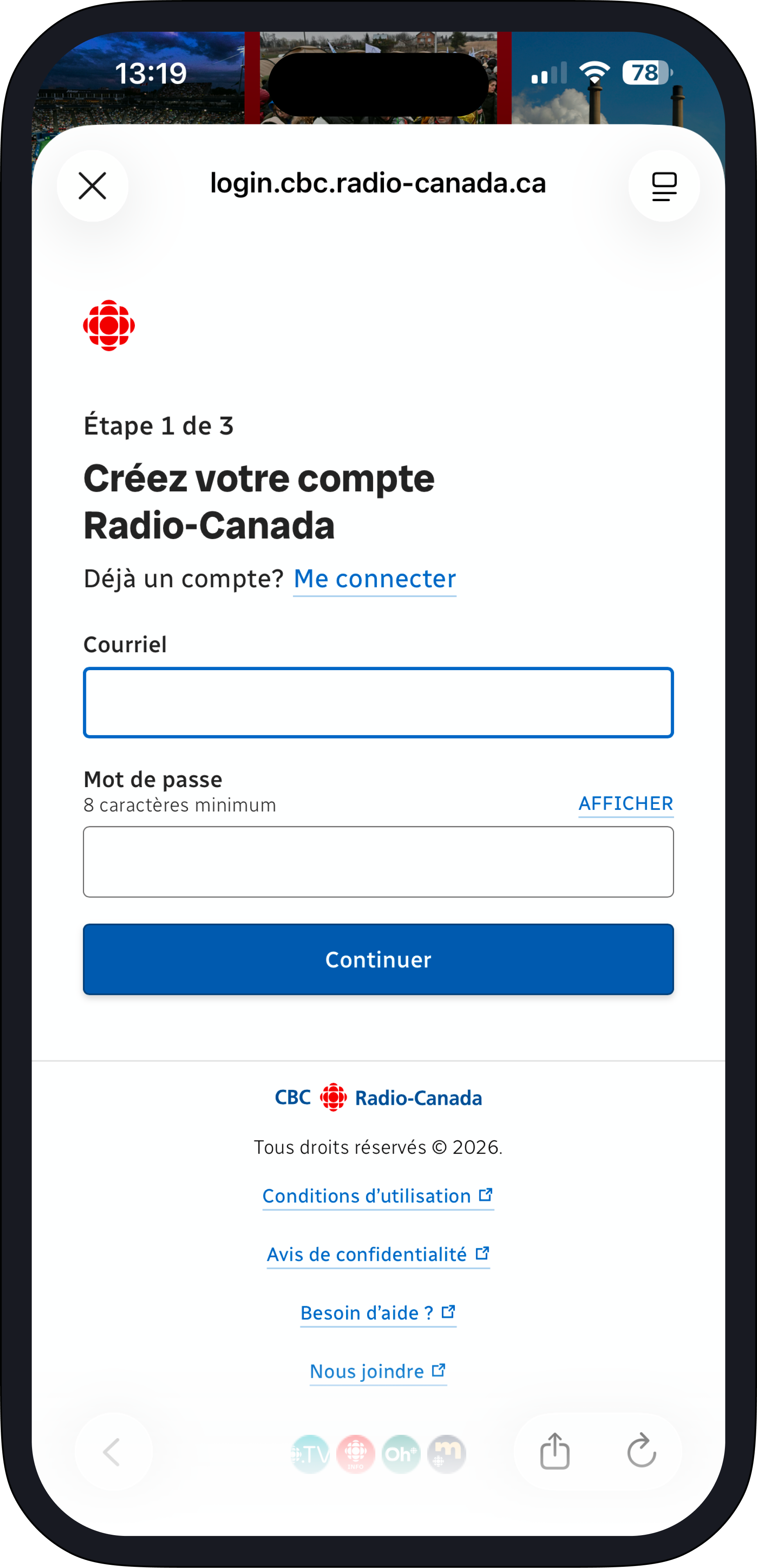
Sign-up perceived as an entry friction to get around
Account creation felt to be long
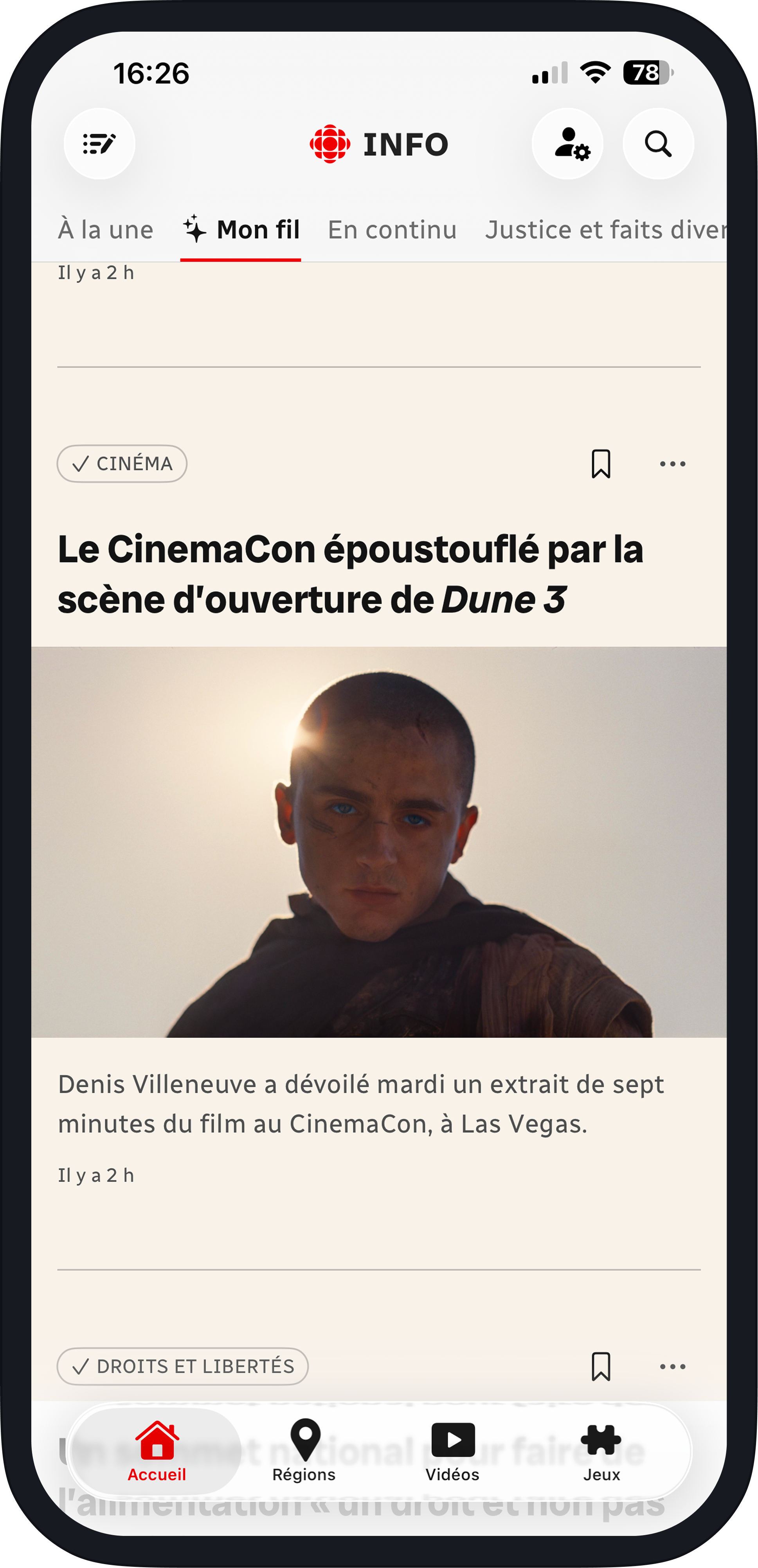
Horizontal scrolling of categories barely visible and unnoticed
Two separate entry points for settings
Changes made hard to understand right away
Journey 3
Navigating to sought-after content
A targeted navigation journey toward sought-after content, adapted to different user profiles that may share common needs and overlap.
Frictions identified
Limited summary and plain-language options for quick understanding
Saved content hard to find and unavailable for In Brief and videos
No format-specific search
Unengaging audio offering, limited to reading long articles aloud for accessibility purposes
Exploring through search is ineffective for certain topics
No quickly accessible summary for an overview of the news
Topic not prominently highlighted in the Top Stories hierarchy, with a preference for the My Feed presentation
Design opportunities
Entry frictions
Explore the barriers at the entry of the Radio-Canada Info app to optimize adoption and integrate news into young adults' routines.
Usage and metadata
Standardize how visible metadata is presented and bring the experience closer to the codes and habits of social media.
Suitable formats
Strengthen the appeal and perceived value of the Radio-Canada Info app to support initial engagement and encourage recurring use among the target audience.
Recommendations
Several recommendations were made to address Radio-Canada's initial mandate. They are structured into three categories. First, improving redirection from social media to the app. Second, reducing friction during account creation. Finally, ideas for adding cues and features suited to young adults' habits.
Using apps' native features
Using social media's native features is relevant in a situation like Radio-Canada's, because it lets you quickly send the user back to the official platform while minimizing the effort required, and therefore create a better conversion rate.
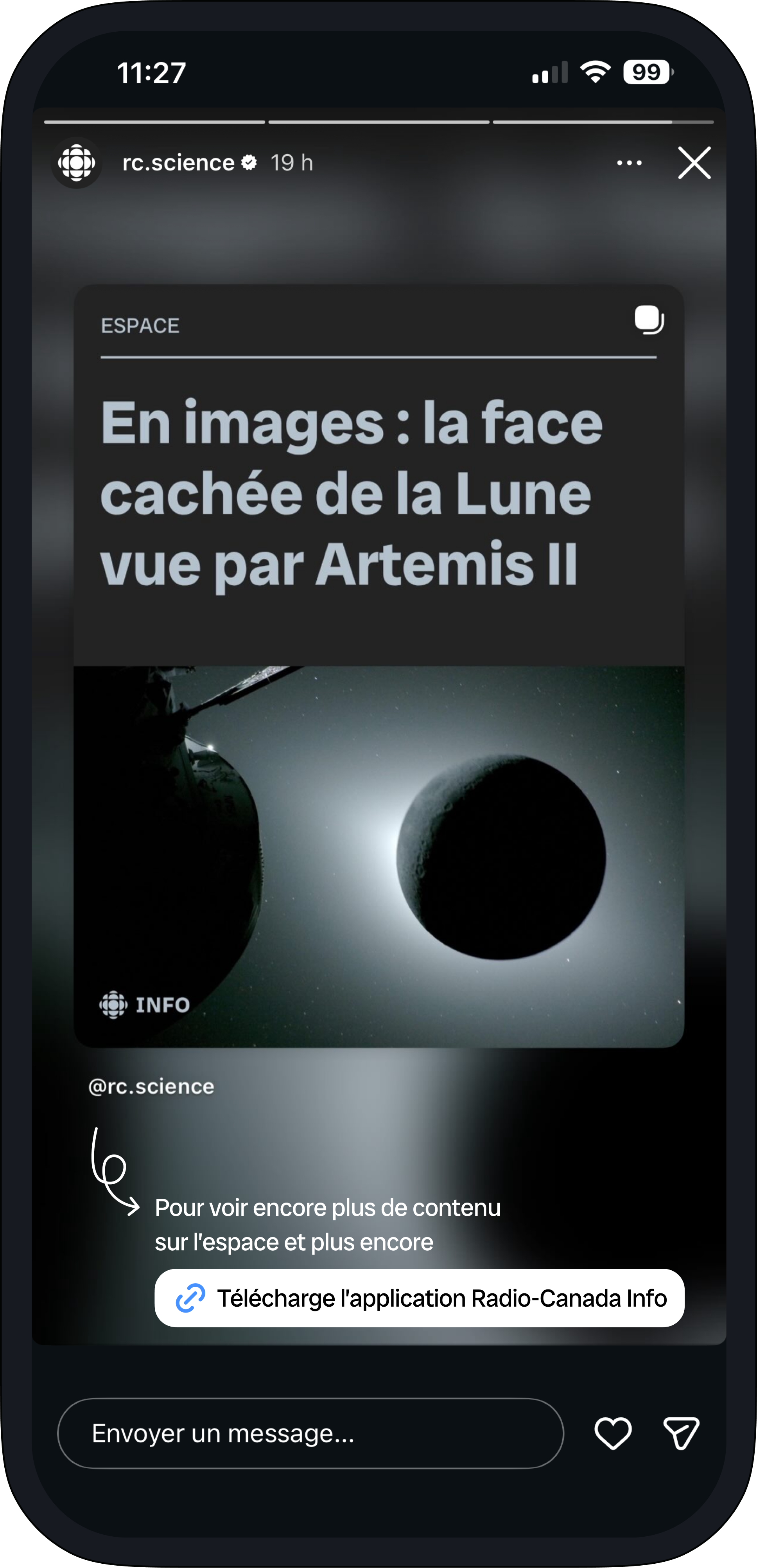
BeforeRecommendation
Quick access
A direct external link lets users download the app in an instant, without friction, to reduce perceived effort.
Standardizing the linktrees
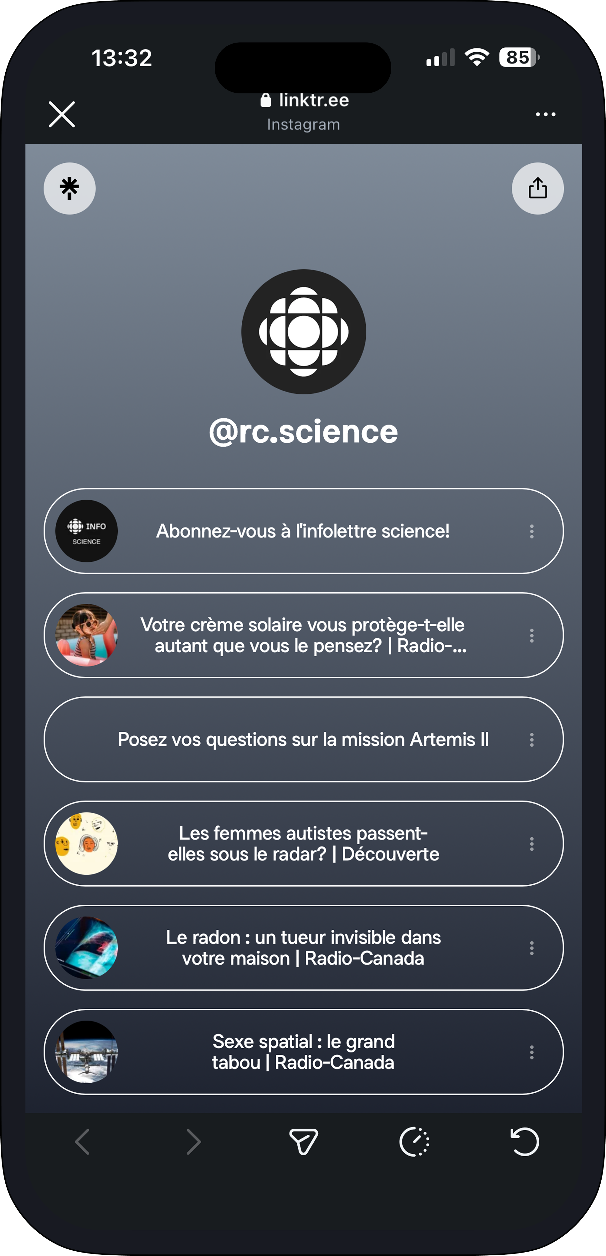
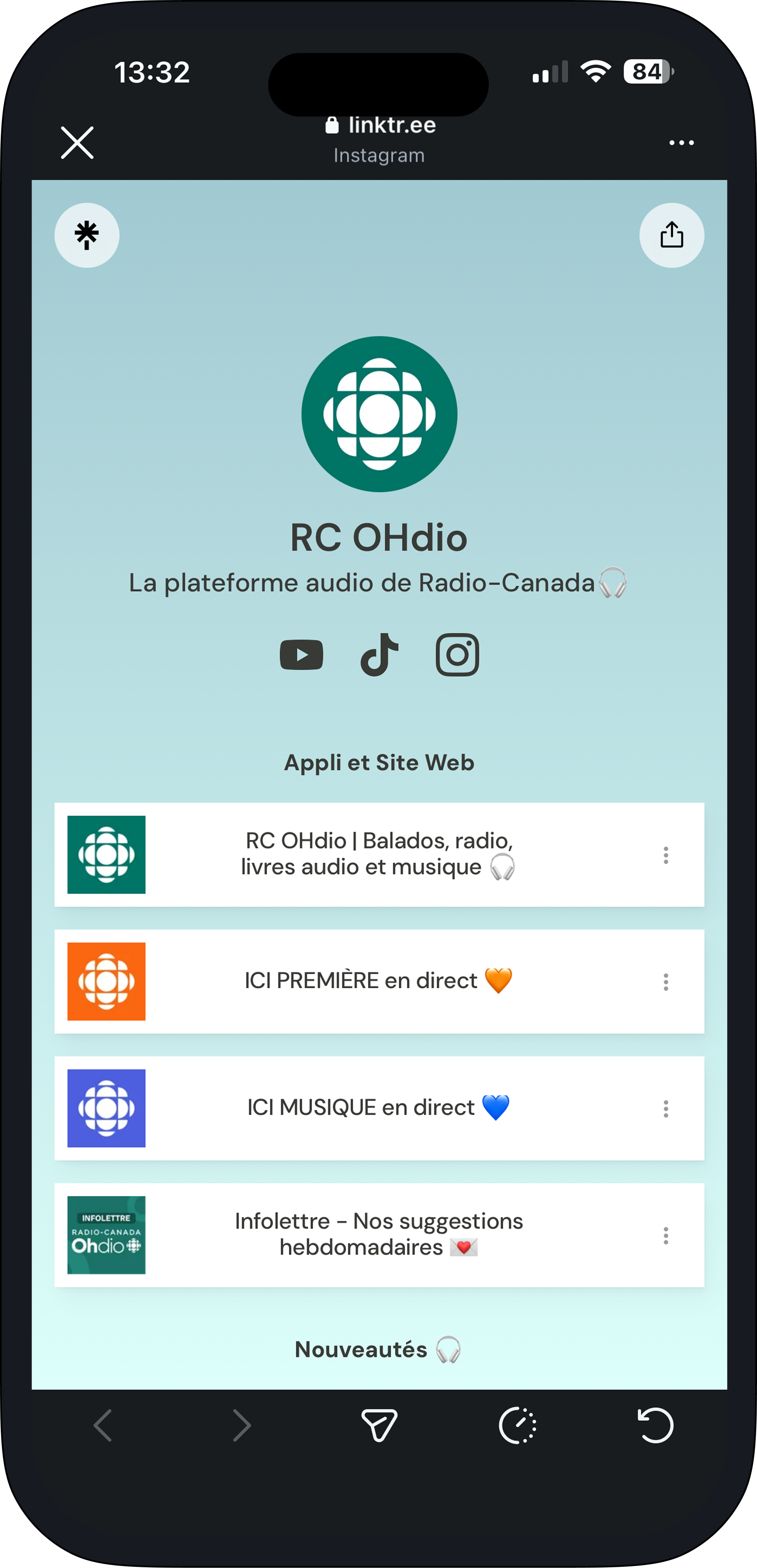
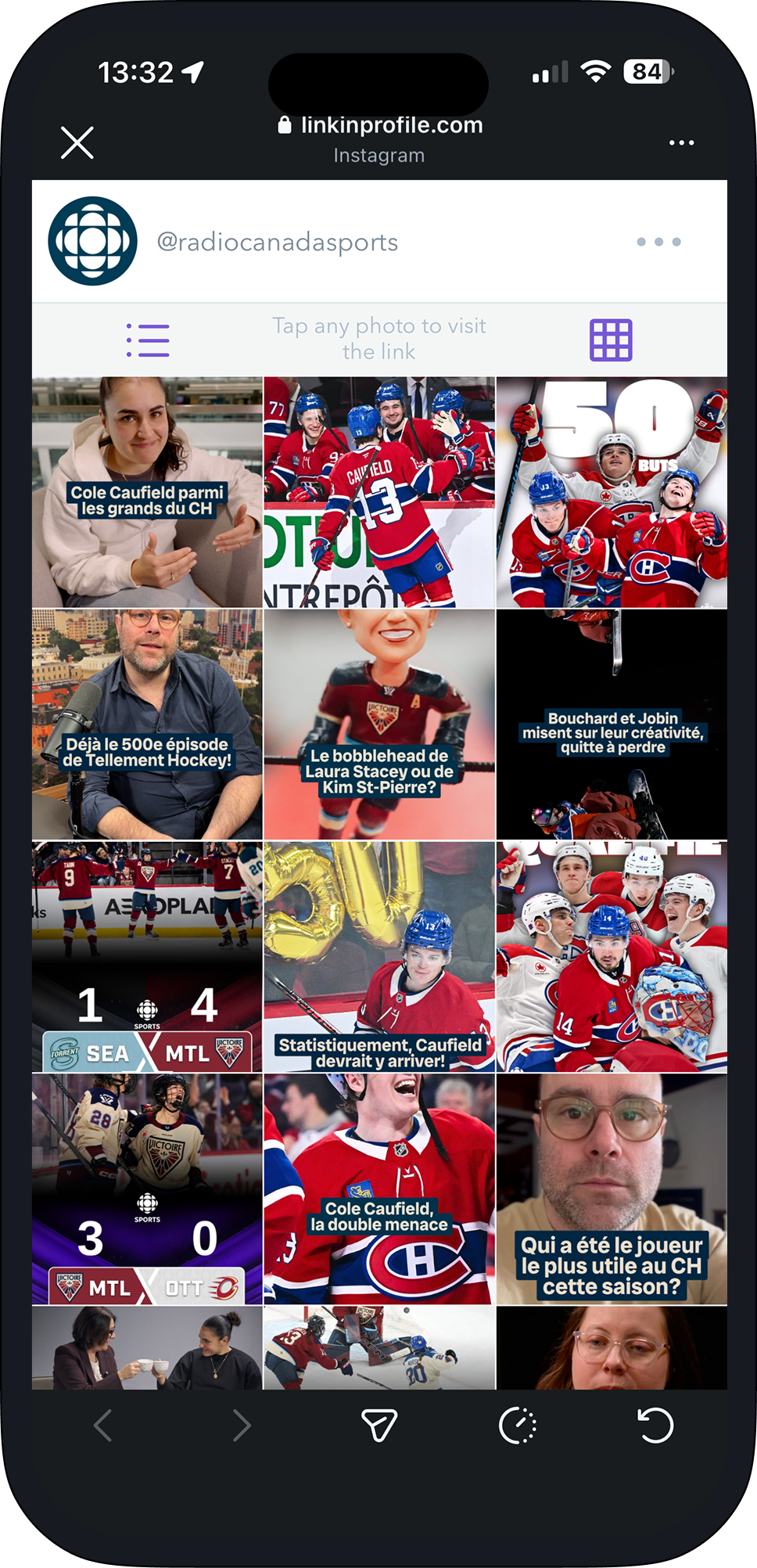
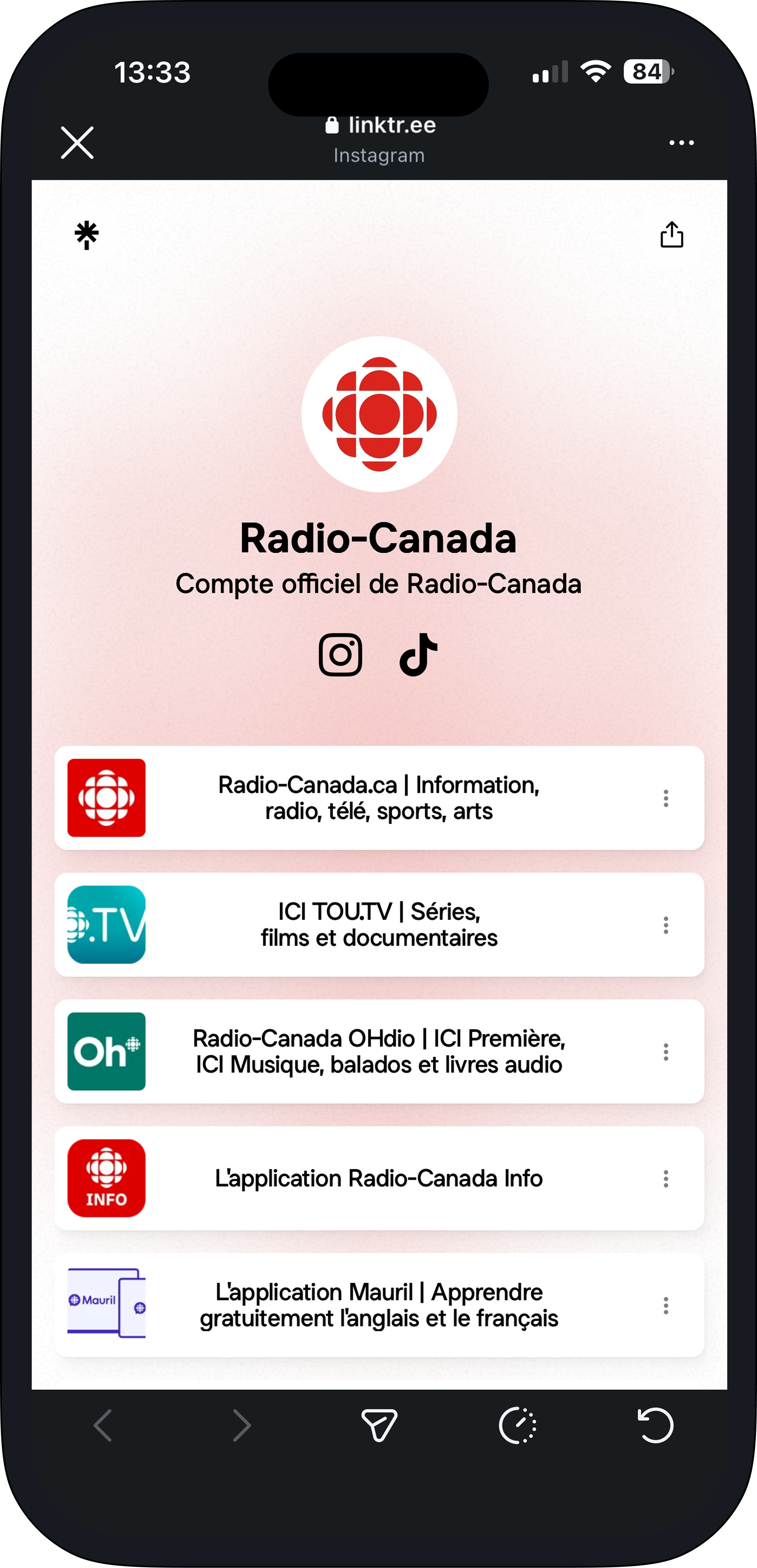
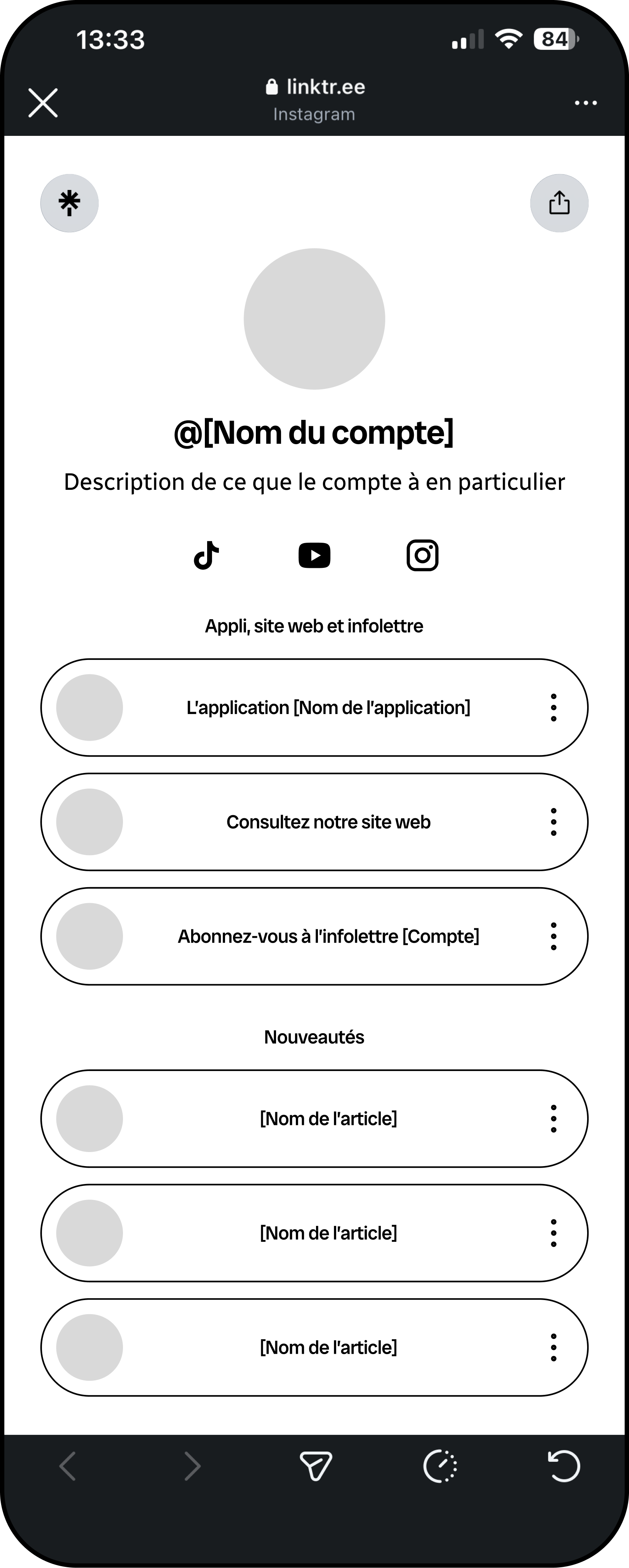
Standardizing the Linktrees seemed essential. Its goal is to give users the same expectations regardless of which Radio-Canada account they visit, while making sure redirections to the organization's external platforms are present and highlighted.
Example of a current linktree
Header
Account image (logo)
Account name
Account description
External links to the account's specific social media
Section 1
The first section centralizes the main access points: the app or apps associated with the account, the redirection to the website, and the newsletter sign-up link.
Section 2
The second section centralizes redirections to a selection of articles specific to the account.
Quick sign-in
Signing in was observed as a clear barrier for new users. Making this step lighter and faster represents huge potential to improve the conversion rate.
BeforeRecommendation
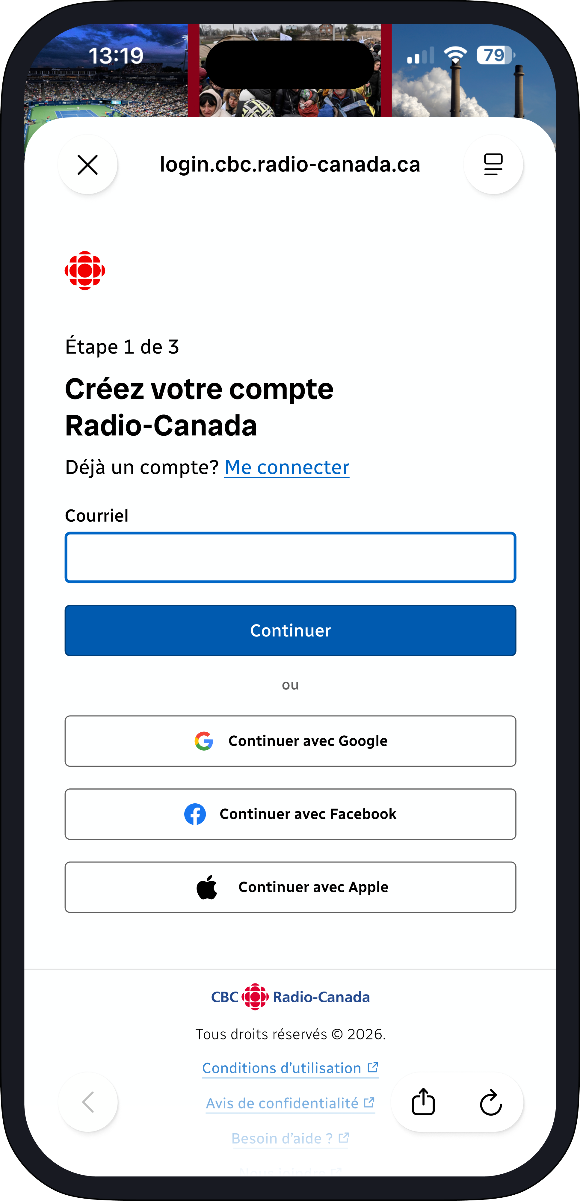
Quick sign-in
Account creation is simplified through sign-in with Google, Facebook, or Apple, an approach that is now essential to reduce any friction and encourage adoption of the app.
Adding indicators
Young adults are aware of the limited time they'll spend on a news app. Some proposed indicators let users adjust based on how much time they're willing to invest in reading articles, the level of depth they want to reach, and their reading preferences.
Before
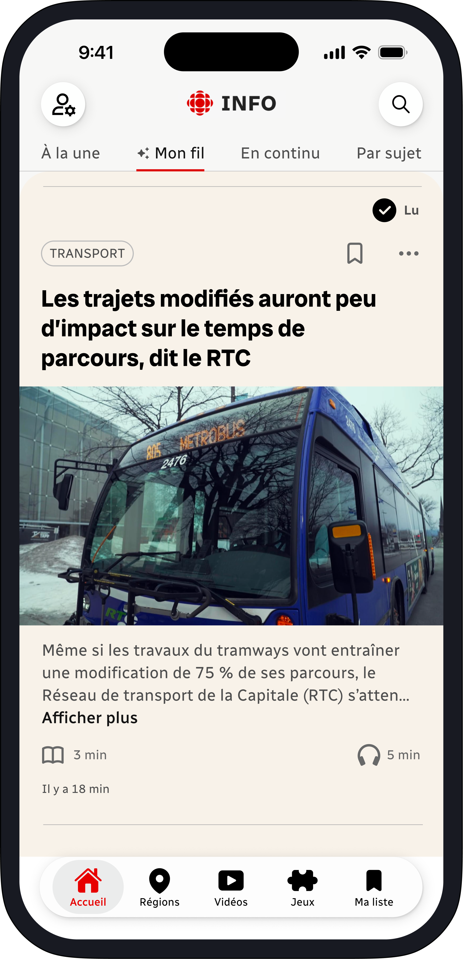
Enriched summary
A more complete summary is accessible directly from the card, letting users grasp the gist of an article without opening it.
Reading time
An indicator shows the estimated reading time of each article, helping users better plan their information consumption.
Recommendation
Read indicator
A visual marker shows whether an article has already been read, helping users find their way through their feed.
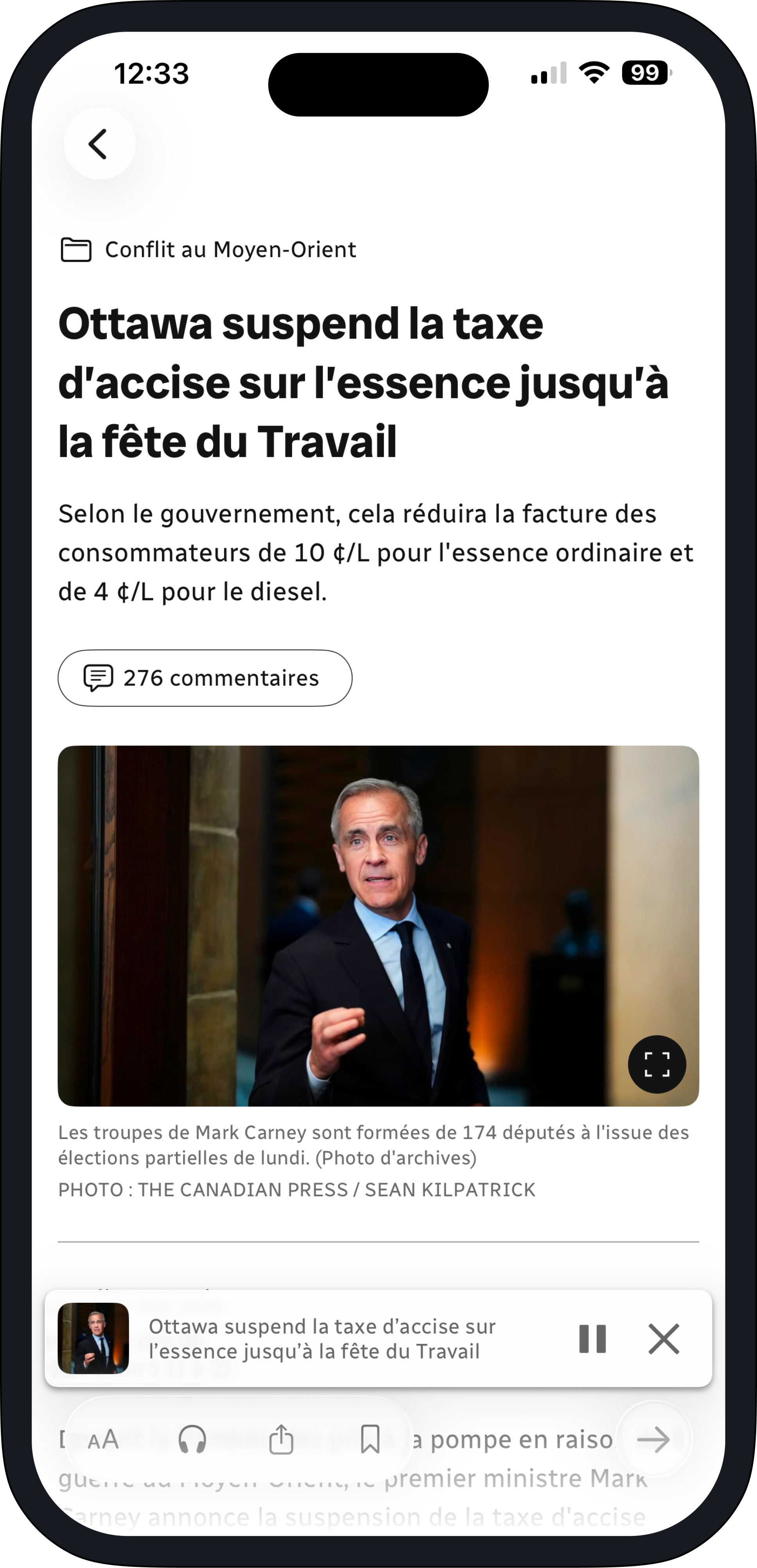
Built-in audio
Users can start audio playback of an article directly from the card, without opening it.
Enhanced audio mode
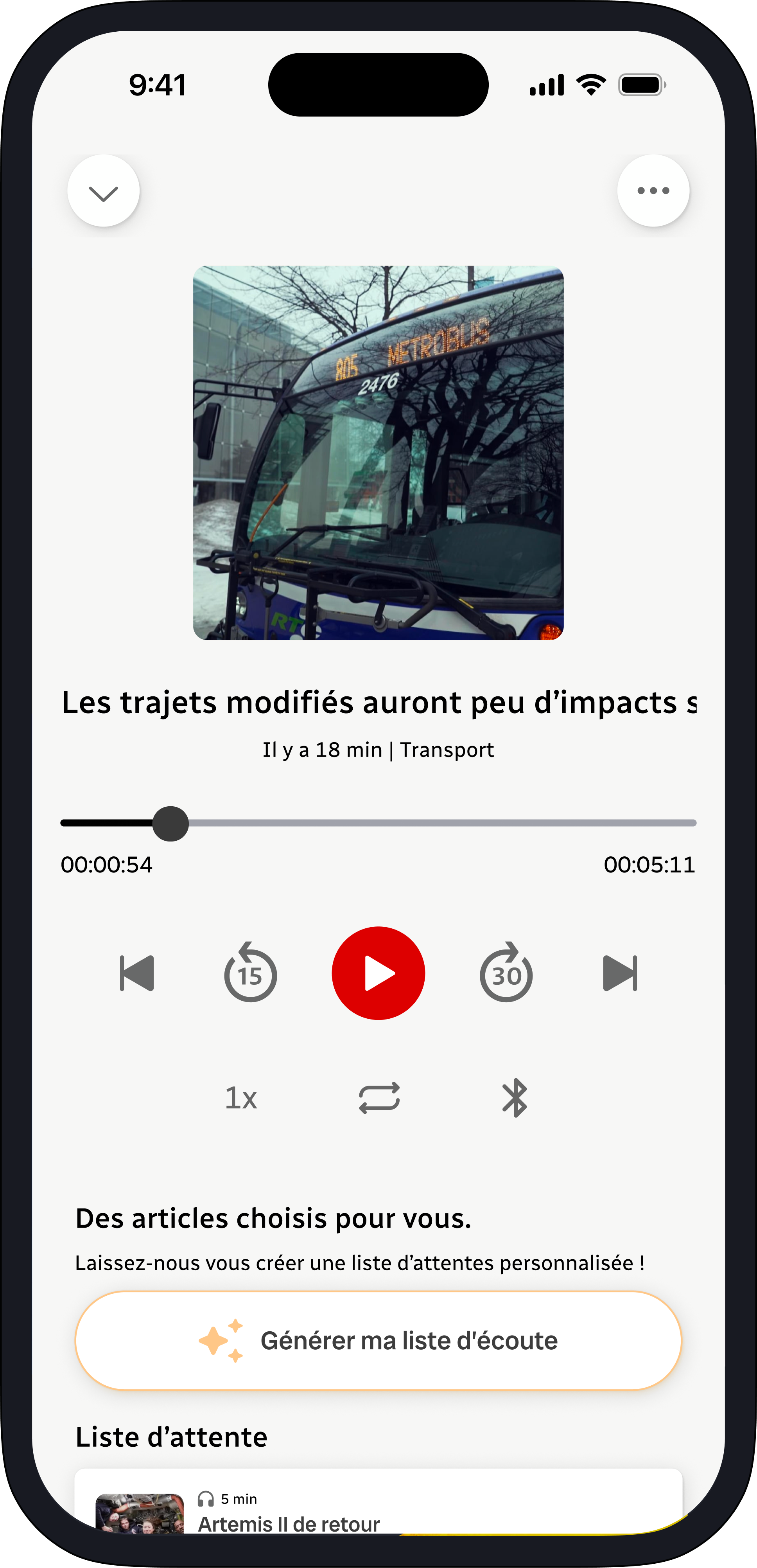
The audio format was observed as very popular among young adults. It fits well with their multitasking habits, whether on the move, cooking, or doing chores. A more developed and complete audio mode can be a good gateway to reach a new audience not yet present on the app.
BeforeRecommendation
Advanced controls
Advanced controls offer a more complete and familiar listening experience.
Personalized playlist
A generator automatically creates playlists tailored to the user's habits and preferences, for a fast, made-to-measure experience.
Adjusting the navigation bars
Two issues emerged from our user research.
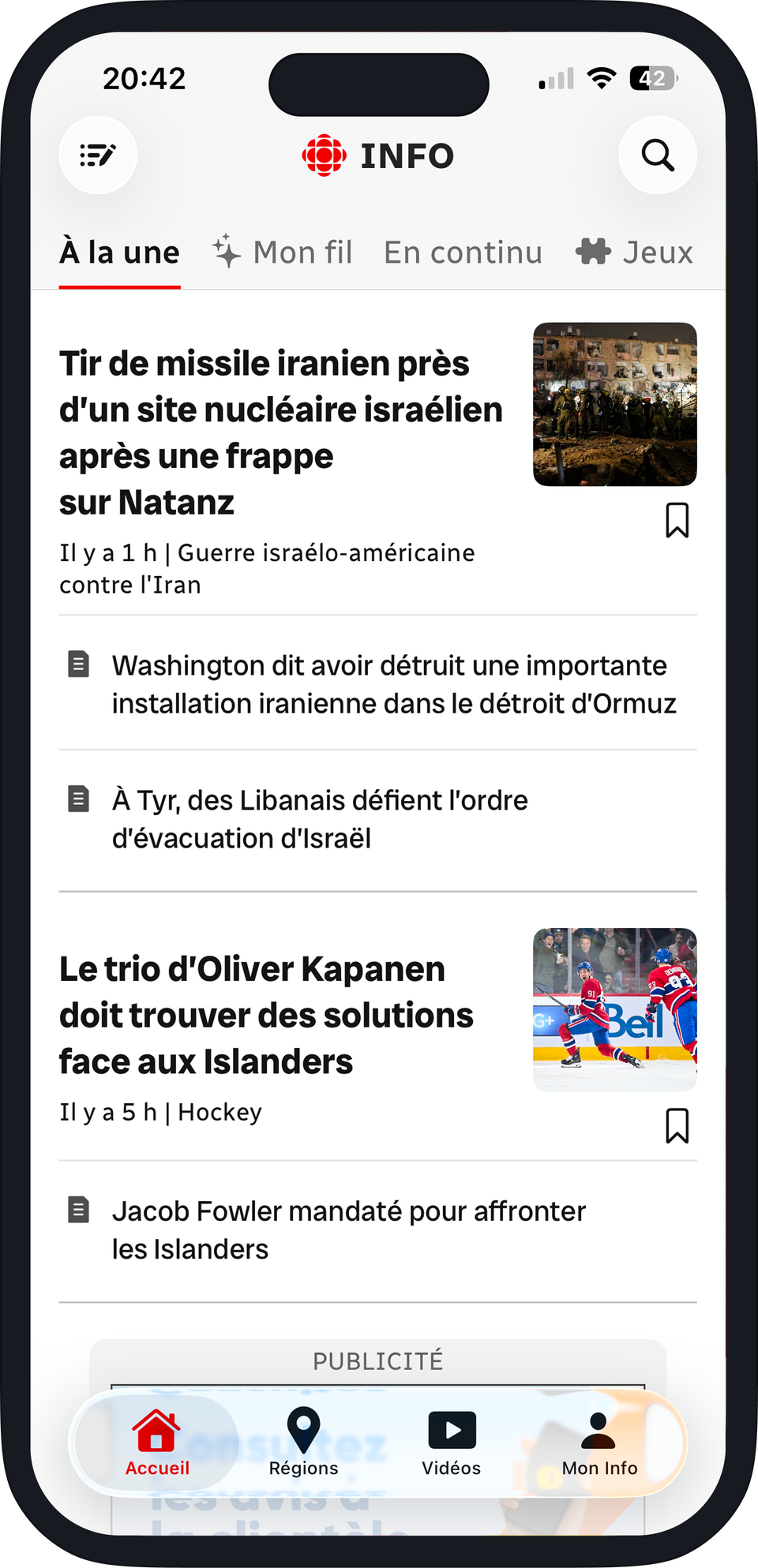
First, the top menu, currently scrolling horizontally, was not automatically understood by new users. They found the scrolling long and the feature to rearrange sections not very intuitive.
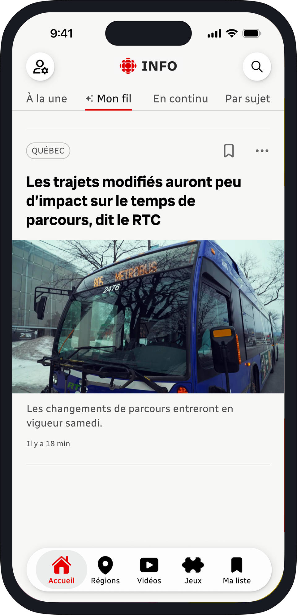
Second, the bottom navigation bar was missing some options that users liked and found useful, such as game mode, which was previously mixed in with the news-reading modes at the top, and the news-saving feature, which was buried too deep in the navigation.
BeforeRecommendation
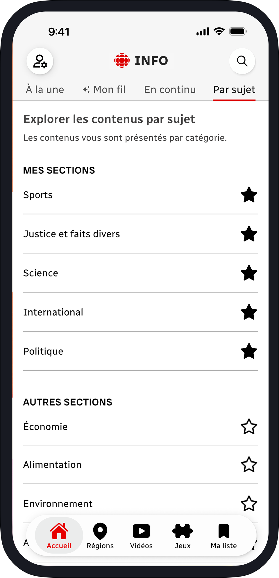
Grouping topics
All topics have been brought together in one place with a favourites feature kept, making everything simply accessible without having to go back into the account settings.
Modified navigation bar
The My News option was moved to the top as an account setting, while adding the Games and My List options follows directly from the observations described earlier.